Today we’re going to go over interpreting data, the numbers and news.
Torturing Data
First, we want to remind everyone, this is us humanity vs COVID-19. This is every person that you love, every person on this big blue marble fighting a germ we only see under a microscope. No one on your Facebook feed is trying to mislead you.
But some people still are. One of the first things you learn in statistics 101 is that if you torture the data enough it will tell you what want to hear.
“Torture the data, and it will confess to anything.”
Ronald Coase, Economics, Nobel prize Laureate
This becomes of particular concern when the consequences are serious and the issues complex. To add to it in our present situation, our knowledge is limited.
Be very skeptical of any “hot takes” in your news feeds that claim to tell you what no one else will, that are “breaking,” anytime someone “destroys,” someone or a point of view. Even the experts in infectious disease and epidemiology don’t agree on the specifics of COVID-19, they do have a consensus of its contours.
We present all of our sources so you can track them down. We offer up our reports for free so you can play with them yourself. We keep the graphs and calculations simple, because if you take data that isn’t accurate and then perform a bunch of steps to turn it into another metric you just get multiplied garbage. It is perfectly clear to anyone in the field or anyone tracking the data that it is imperfect. It’s also the best that we have.
When my kids were younger they thought that they could just throw some flour, yeast, salt and water together to make bread. The proportions didn’t matter to them.
Nothing useful was produced.
And that, friends, is what happens in most of the posts that hype misinformation.
Numbers
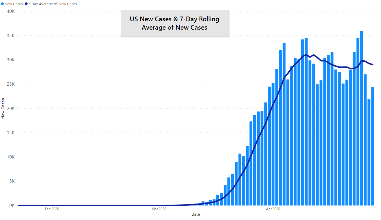
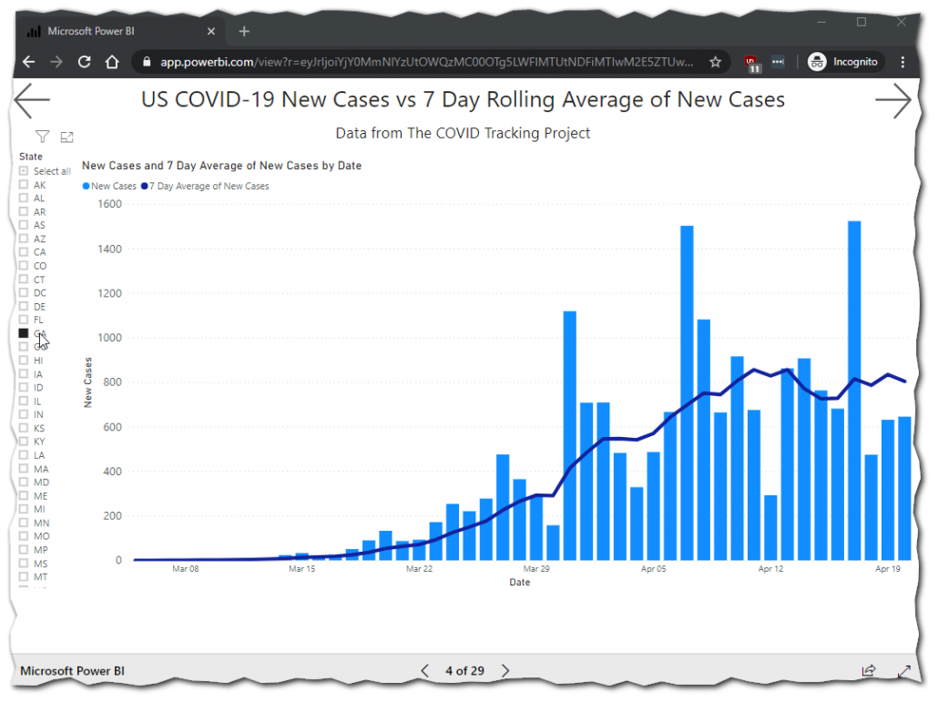
US Cases are still pretty much flat nationally since peak in mid April. The 7-day average of new cases per day is only down to 29,000 from 31,000. We’ve successfully stalled the acceleration of growth but we’re not reducing the size of the epidemic, it’s on cruise control.
If there is good news in the charts below it is that we are beginning to test better. We’re not doing great, just better.
Positivity rate
The number of confirmed cases divided by total tests performed. This gives one an idea on if enough tests are being performed. Dr. Fauci has indicated that he’d like to see the US at 10%.
US New Cases by Day
US COVID-19 Positivity Rate by Day
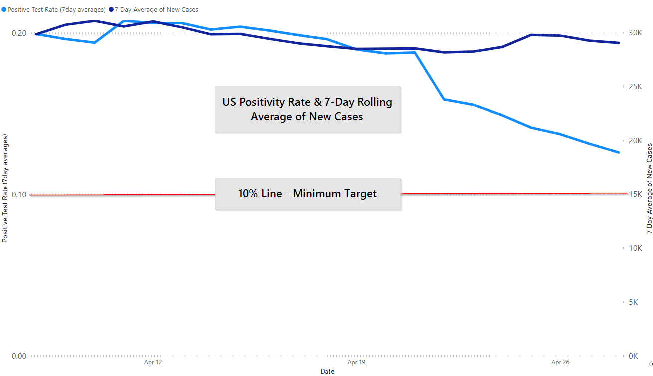
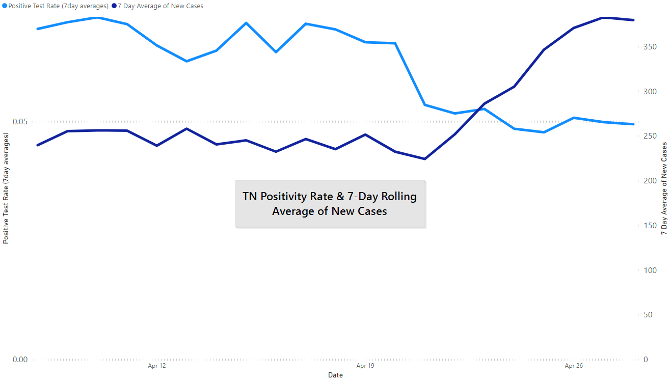
Balancing out the spike in cases is a flat-ish positivity rate. At 5% positivity rate (6.2% cumulative) Tennessee: we make up 2.72% of all US tests and 1% of all US COVID-19 cases.
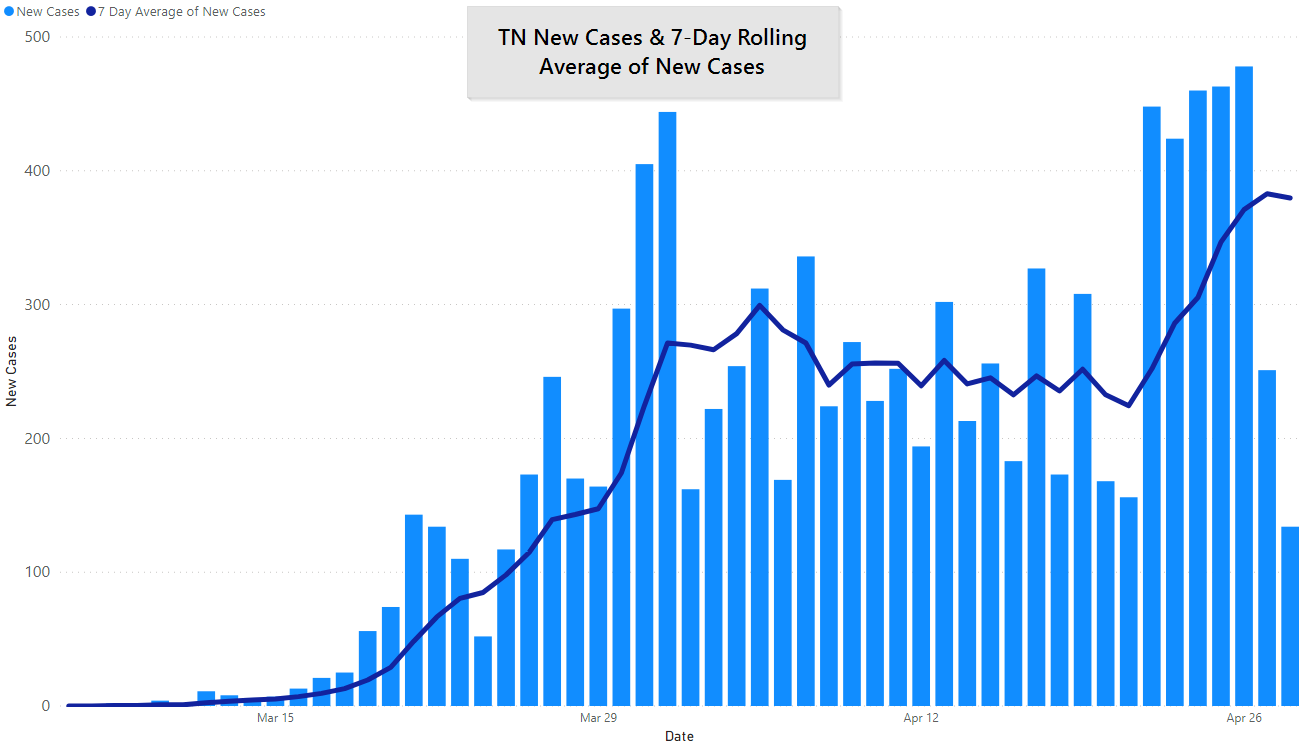
TN New Cases
TN Positivity Rate (about 5%)
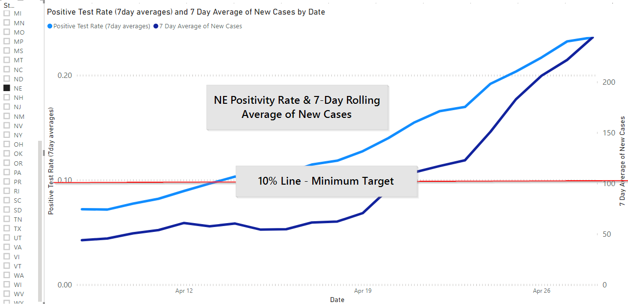
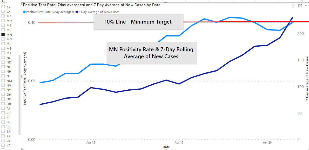
For comparison, you have the US positivity rate up top, or below, Nebraska and Minnesota. Nebraska is clearly headed in the wrong direction, with an outbreak at a rural beef meat packing plant that appears to be driving up the cases, and hence the positivity rate. Minnesota’s new cases appear to be outpacing new testing (not shown, see MDH website).
NE Positivity Rate
MN Positivity Rate
By the way, if you want to see the same graphs for your state click here, we pull nearly all of our own visuals from this report. Typically updated at the same time the evening’s post goes up.
Here are GA new cases.
Also, you can do it on your phone but it is much easier to navigate on a bigger screen.
Alright, so why look at Minnesota and Nebraska? Mostly to again indicate that there isn’t just one way to monitor COVID-19 in the US or one testing number to hit. Nebraska probably felt good about their testing until outbreaks in rural areas (their metro areas are faring much better, right now).
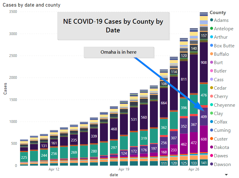
It’s interesting — and sad — by itself, but also instructive for every other state: rural areas are not spared.
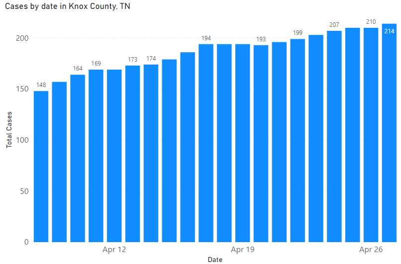
We’re using a different chart for Knox County today, the only time series data we have is in tabular form is from the New York Times, which occasionally disagrees with KCHD’s website on any given day. As a whole, it’s accurate. However, looking at just the last 21 days gives you a better feel for just how gradual the growth is here.
Short of no new cases it is hard to imagine us doing any better.
Knox County total cases by day
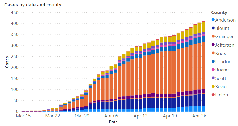
Nine county area cases by day.
A Look at the Week Ahead
We said yesterday that the US would hit 1,000,000 cases, today we did.
President Trump signed an executive order ordering slaughterhouses to keep working. It’s a complicated issue, immigrants make up a disproportionate share of workers, Jeff Bender (UMN, Professor Division of Environmental Health Sciences) said today on a webinar that more than 20 languages were spoken at one of the recently closed plants. It doesn’t seem possible to physically distance and the plants and many of the works live in residences where physical distancing is difficult.
When you combine that with a hold on immigration for 60 days, ensuring that there even are workers available seems like it could be challenging.
Governor Lee issued Executive Order 30, which repealed most of his other orders. Gatherings of 10 or more or still prohibited (but churches, weddings, funerals, etc. are allowed). Gyms are allowed to open Friday at 50% capacity.
This order explicitly overrides any other county or city level orders except Davidson, Hamilton, Knox, Madison, Shelby and Sullivan counties.
Still Closed
- Bars
- Salons/spas
- Night clubs
- Bowling alleys
- Concerts
- Others similar to the above
Tennesseans have to stay committed to social distancing.
GOVERNOR Lee, April 28th, 2020
Governor Lee also confirmed that healthcare providers in Tennessee treated uninsured persons will be reimbursed by a combinations of federal and state funds.
Dr. Piercey spent a couple of minutes going over the importance of cloth masks, guidance we endorse.
Life Care Center in Athens is confirmed to have 51 ceases. All residents have been tested, all associates have testing available. This will almost certainly result in a lot deaths. The fatality rates go up significantly with age (see yesterday’s post).
Unemployment
Dr. McCord confirmed today that “if you don’t have a clear reason not to go back [to work],” you are not eligible for continued unemployment benefits. If you have a specific reason (i.e., you are a high-risk individual, that will be looked at on a case-by-case basis.
See the video for briefing highlights today.
As you head into Monday and May 1st remember what side you’re on: our side, humanity’s side. Think about what you can do to stay safe and protect others — a one-size-fits-all answer is probably the wrong one.
These posts helpful?
Then go ahead and share them where you saw them once or twice a week.
Get In Touch
Need help thinking this through? Access to more data? Help getting your technology in order to handle what’s here and what’s coming? Contact us today.
[wpforms id=”4995″]Other
Thanks to those that have shared kind words or liked these posts. We’re doing out best to put out data-driven analysis, each one of these takes about 2 hours. It’s helpful to know that they are being read.
If you want copies of the Excel sheet and PowerBI Reports we use to put these together email us, info@jmaddington.com. Right now, our PowerBI combines data from JHU, NYT, COVID Tracking Project, IMHE and the TN Department of Health. Most sets are updated daily.

Download our Report!
Get your copy of What Every Business Owner Must Know About Hiring an Honest, Competent, Responsive, and Fairly-Priced Computer Consultant.