Today is about map reading, and accuracy.
The biggest we face — at least at JM Addington — in projecting out what the next few weeks look like is the lack of consistent, quality data. First, a really quick primer on the stats we are watching:
New hospitalizations: Number of new people admitted to the hospital. This is not the number of beds in use as most people will stay more days or weeks. Lots of new hospitlizations indicate pressure on the entire healthcare system.
New deaths: New number of deaths attributed to COVID-19. Unlike cases deaths don’t depend on someone running a test. However, they can still be undercounted (someone dies without ever having a test) or overcounted (a person with multiple health issues happens to get COVID-19 and pass away, but they may have regardless). Best used in combination with new cases.
New cases: New, confirmed (i.e., tested) number of cases of COVID-19. Best used in combination with new deaths.
Tests: Number of tests performed. Typically, one test = one person although that doesn’t have to be true. The data on testing in the US is not consistent. Tests are often broken out into pending/positive [cases]/negative.
Ok, let’s roll.
We have two significant issues with testing, at least as far as the data tell us. First, we haven’t tested that many people.
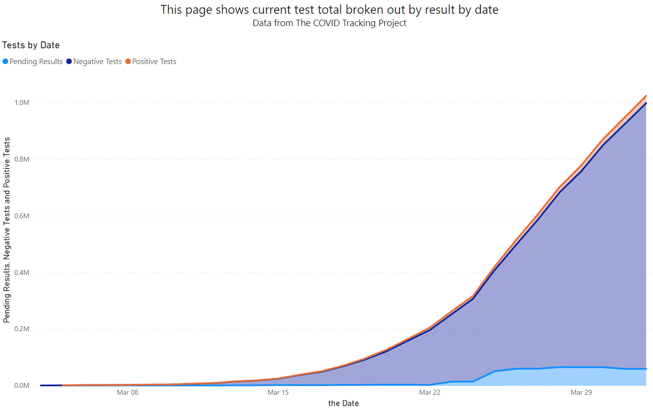
While testing is clearly ramping up, testing less than 1/300 just isn’t where we need to be today. Just as significantly, those tests are performed in heavily concentrated areas:
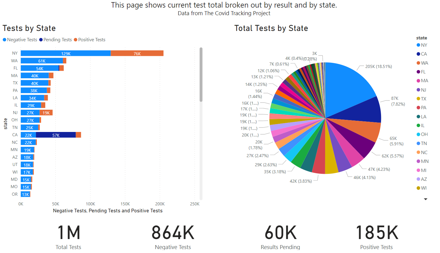
New York, a state with less than 9 million people, makes up 18% of total US tests. California has 8%, and so on. On the one hand we certainly expect that NY has the most tests as they also have the most cases far and away. But if we test them the most we’ll also find more cases. It also overweights the data for the US as a whole. In some fields, this could be corrected. We haven’t seen any convincing evidence that such statistical correction (cleaning up dirty data) is yet possible with the COVID-19 tests.
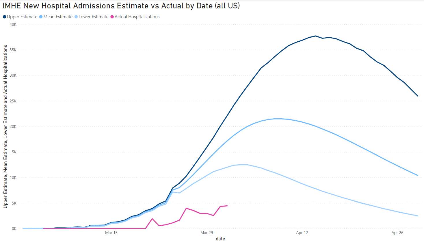
We wanted to see how those IMHE projections were mapping up with reality. These are some of the projections that the White House has been relying on when giving guidance over the next month. IMHE updates the model as new data comes in so we compare current data against their first mode (March 27th) and today’s:
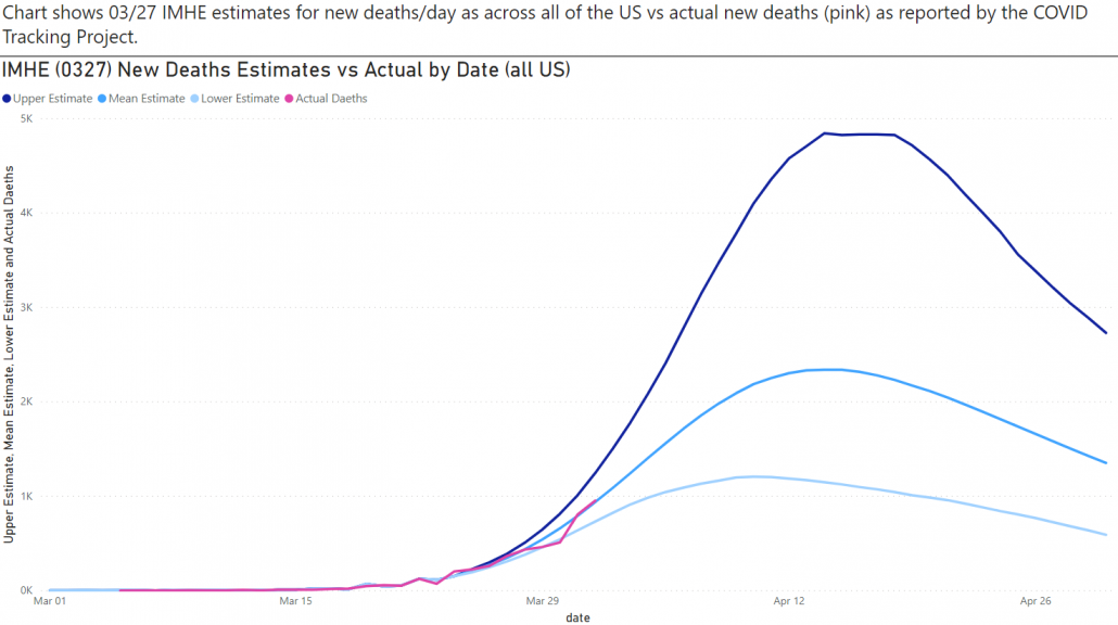
The blue lines are IMHE’s worst-case scenario, best case scenario and their splitting-the-difference scenario for new deaths by date. The pink is where we actually are, you can see that it is tracking closely.
Today’s updated model looks remarkably similar:
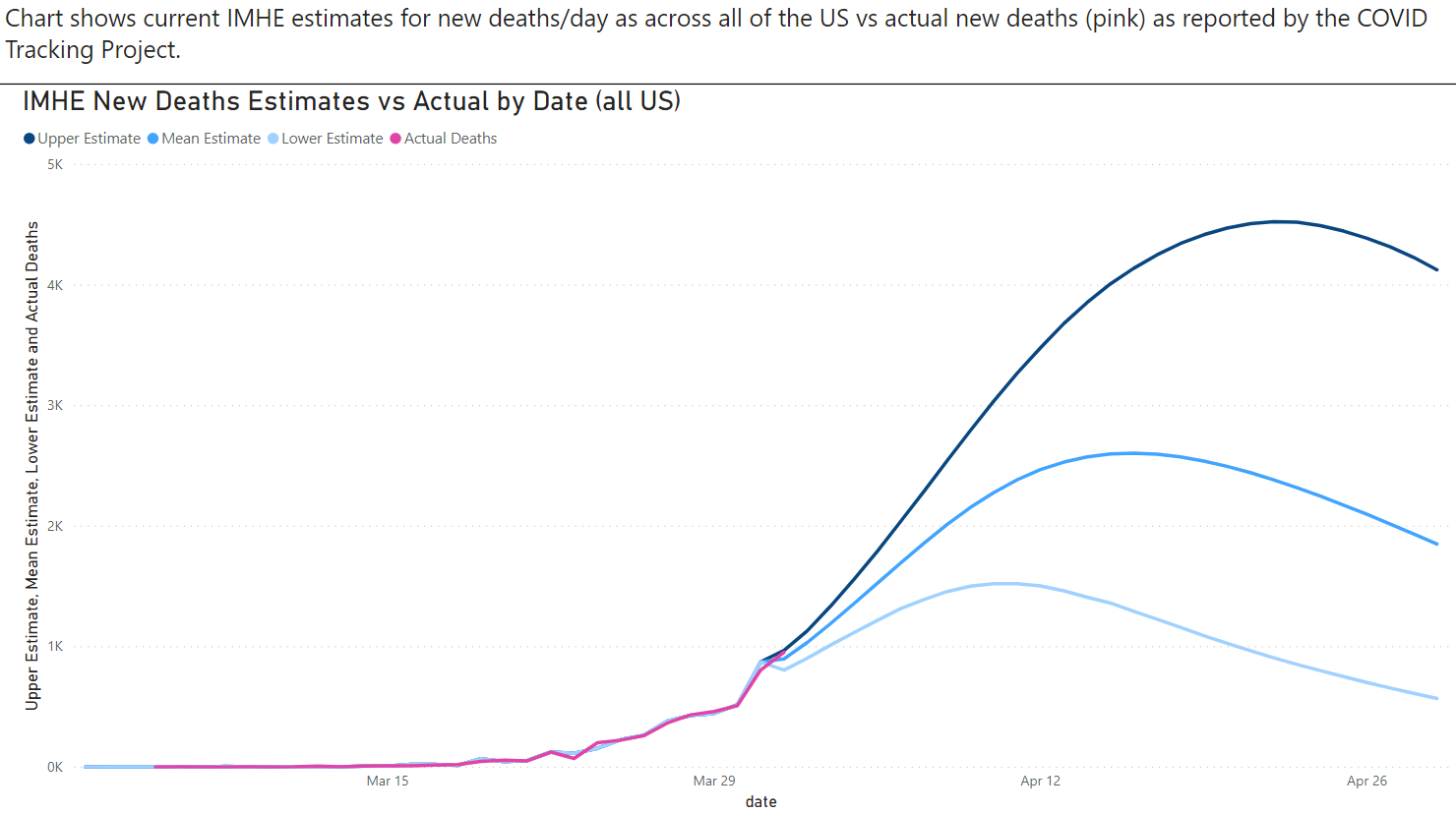
Four days isn’t a long time out for a model to predict but it’s enough to give us some confidence that it is off to the right start. The new hospitalizations (today’s model), in contrast, seem to be off by a fair bit. It’s also possible that the data is lagging.
As long as these models show accuracy we’ll keep them up as a way to score where we are on the curve.
It’s also important to remember that these curves can be highly localized, that is, TN is different from NY and even Knox County is different from Davidson County. All of the US-as-a-whole charts around COVID-19 are heavily weights towards NY right now. That does not mean to dismiss the data, just remember that portion of the data is telling you a different story.
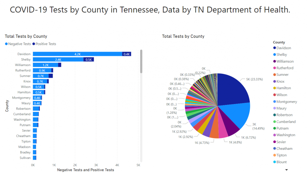
In Tennessee, we continue to have two counties dominate the number of total cases — and tests:
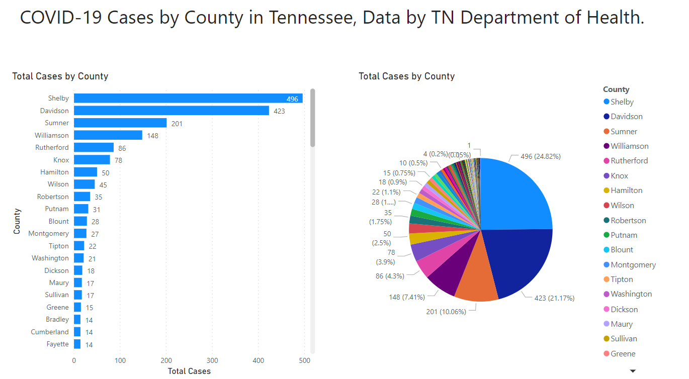
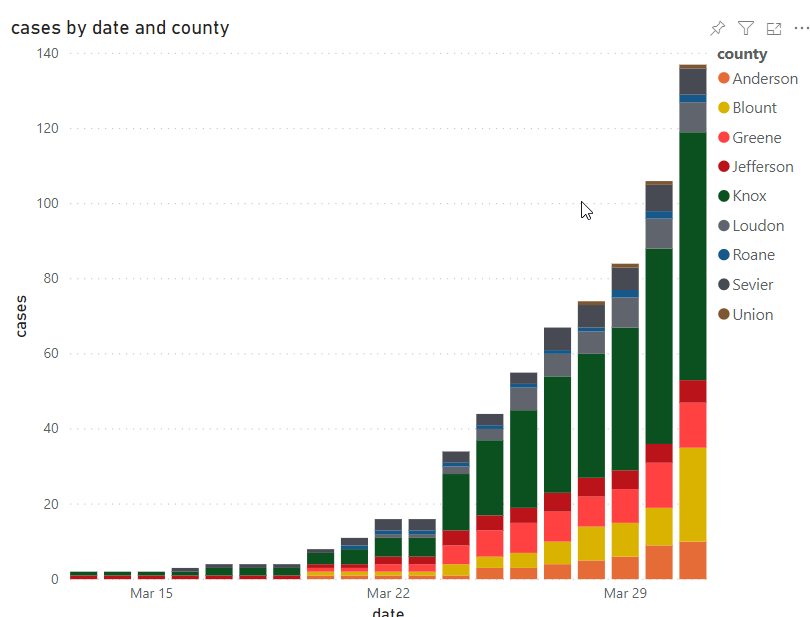
Candidly: the numbers for the Knox County area continue to surprise us. While still increasing exponentially, the absolute number of cases is still incredibly small, on the whole.
Only 157 positive cases as of today in the 9-county area.
It is, almost, unbelievable.
That also brings us back to our beginning problem: how good is the data? 700 tests out of 200,000 people (Knoxville) wouldn’t be an awful statistical sample if it were randomized. At the same time, the signals coming from the Knoxville County Health Department and Mayor Kincannon are, subtly, that they believe these numbers are too low as well.
We don’t have a good answer for you right now and we’ll refrain from guessing. We’re just going to present the data that we have.
International Numbers
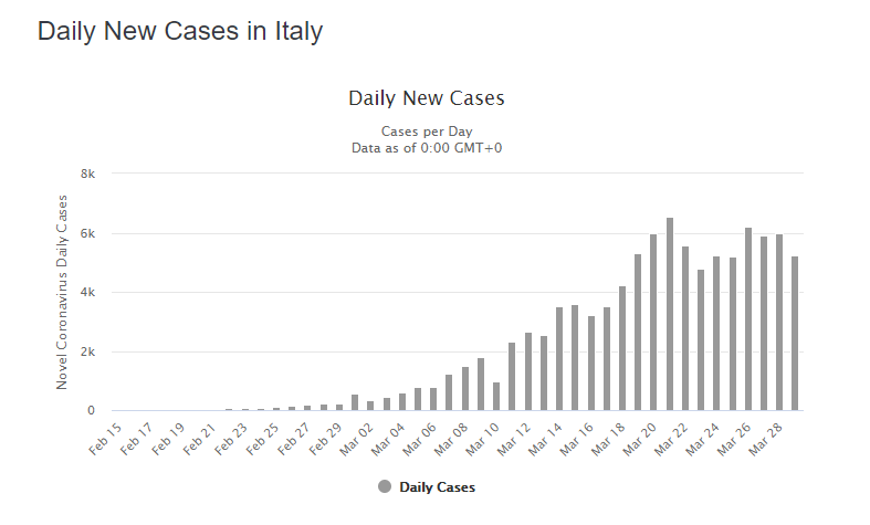
Italy’s new cases are still, overall, going in the right direction.
Spain, Germany, France and the UK are all still on the upward curve, or at least not clearly trending down.
Other
Thanks to those that have shared kind words or liked these posts. We’re doing out best to put out data-driven analysis, each one of these takes about 2 hours. It’s helpful to know that they are being read.
If you want copies of the Excel sheet and PowerBI Reports we use to put these together email us, info@jmaddington.com. Right now, our PowerBI combines data from JHU, NYT, COVID Tracking Project, IMHE and the TN Department of Health. Most sets are updated daily.

Download our Report!
Get your copy of What Every Business Owner Must Know About Hiring an Honest, Competent, Responsive, and Fairly-Priced Computer Consultant.