First, we will go over the top two COVID-19 views we believe are being left out of the public discussion, second, hit national and regional headlines and finally go over numbers.
If this page is too long for you, read until “News” and stop there.
View 1: It is a Long Road Ahead
As things begin to “open up” it is easy to get lost in the feeling that we’re somehow over the hump or the worst of the virus. This is, at best, half true.
First, US cases and deaths, if you discount New York, are either plateaued or showing a mild decrease — and then for only about a week. (See Numbers below)
Globally, cases and deaths simply continue to rise.
Second, there is no indication that COVID-19 will slow its spread in a permanent way until we hit 60-70% of the population infected. If you assume that about 5% of the US population has been infected and consider our current death toll (~75k for our napkin math here) you end up with:
(60% / 5%) x 75,000 deaths = 900,000 deaths left to go, give or take.
(The most optimistic estimate would be about 300,000 deaths total, the most pessimistic about 1,000,000 deaths total).
Or, simply consider how many more “Aprils” we have to go through.
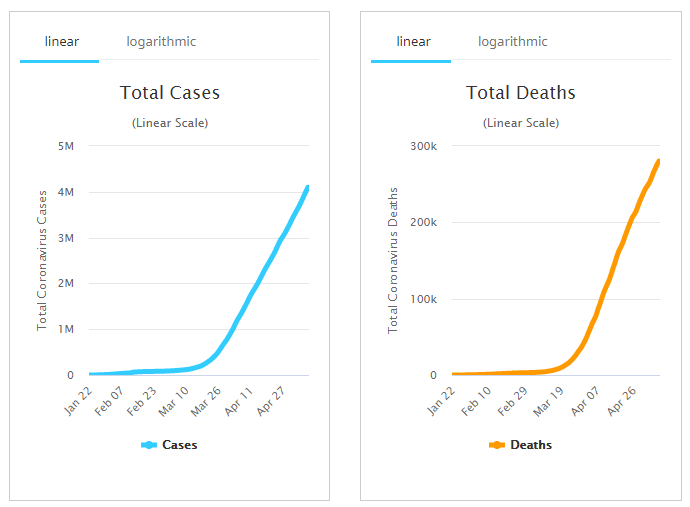
Source: Worldometers
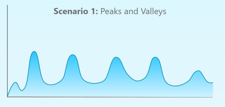
Three of America’s leading epidemiologists, Kristine Moore of the University of Minnesota, Marc Lipstich of Harvard, Michael Osterholm of the University of Minnesota and John Barry — a historian of the 1918 flu pandemic, co-wrote a paper that goes over the three scenarios that they think are the most likely for increased infection.
In Scenario 1, we continue to go through, “a series of repetitive smaller waves
that occur… over a 1- to 2-year period, gradually diminishing sometime in 2021.”
This, “Peaks and Valleys,” scenario doesn’t assume that all places experience COVID-19 equally. While the first “wave” hit New York, Chicago, Louisiana, etc., a second wave may hit Denver and Austin, a third Atalanta and Minneapolis, etc.
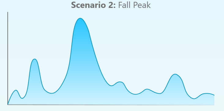
In the second scenario, COVID-19 actually lets up over the summer (the second dip in the graph) and “is followed by a larger wave in the fall or winter of 2020 and one or more smaller subsequent waves in 2021.”
This is what was seen in both the 1918-1919 and 1957-1958 flu pandemics. Dr. Osterholm describes this as the worst scenario, and one where we possibly have the heath care system overrun.
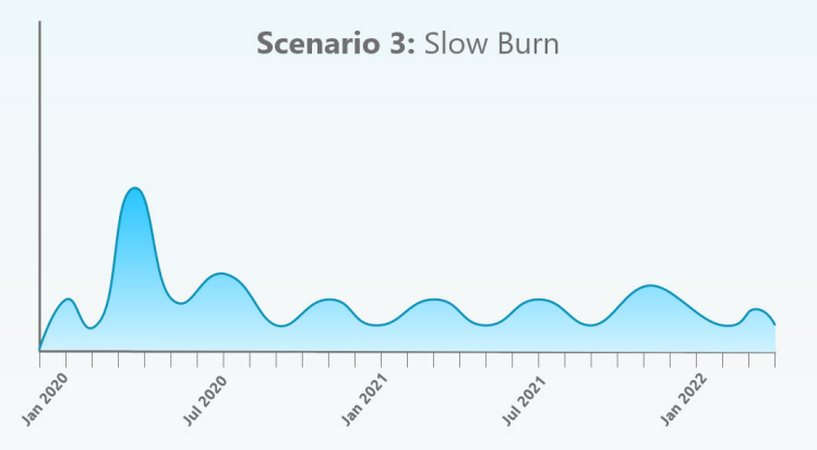
In the third scenario, our current spring peak “is followed by a “slow burn” of ongoing transmission and case occurrence, but without a clear wave pattern.”
This scenario, like the first, assumes that different places experience their own outbreaks at different times.
The report ends with the one thing we wish every American was aware of right now:
[W]e must be prepared for at least another 18 to 24 months of significant COVID-19 activity…COVID-19: The CIDRAP Viewpoint
This is critically important if we want to learn how to live with the virus, opened-up. Planning on the family level, the work level, the city/county/state/country levels are all crucial to us going forward as we get through this instead of finding ourselves frozen.
View 2: Unlit Powder Still Explodes
In places such as East Tennessee, among others, it feels right now like we dodged a bullet, that things are safe now. You can see it most clearly when people don’t take advice from public health authorities. With about 1 case for every 2,000 people it is an easy view to take.
It’s also incredibly wrong.
We are in a storeroom of 50 dry gunpowder kegs where a handful of them have exploded, just not ours. However, the fire still smolders and we are still a keg of dry powder.
And that’s the state we live in until the fire is out.
News
The most important news item of the last few days goes to a new antigen test that the FDA has granted emergency approval for. It looks like it’s great for reporting positives, for negatives a PCR test is recommended to confirm. I.e., it can tell you if you have COVID-19, however, if you test negative there is still a 1/5 chance you have COVID-19. Cheap, 15 minute turn-around times. Of course, it still needs to be mass-produced.
Unemployment is up to nearly 15% and Treasury Secretary Steven Mnuchin said, “the reported numbers are probably going to get worse before they get better.” Our guestimate is that it wouldn’t be surprising to see that double in the short term (2-3 months). Remember, we asked everyone to stay home for a few weeks: these numbers aren’t yet surprising.
Vice President Pence’s press secretary and at least one other White House aid tested positive for COVID-19. It will be interesting to see how this type of low-level exposure will affect leadership at all levels of governments, and organizations. Do top leaders need to self-isolate every time they have had potential contact with a COVID-19 positive person? (Pence is not) If the leader never gets infected, that is potentially a never-ending string of self-quarantines. (True for any person, not just leaders.)
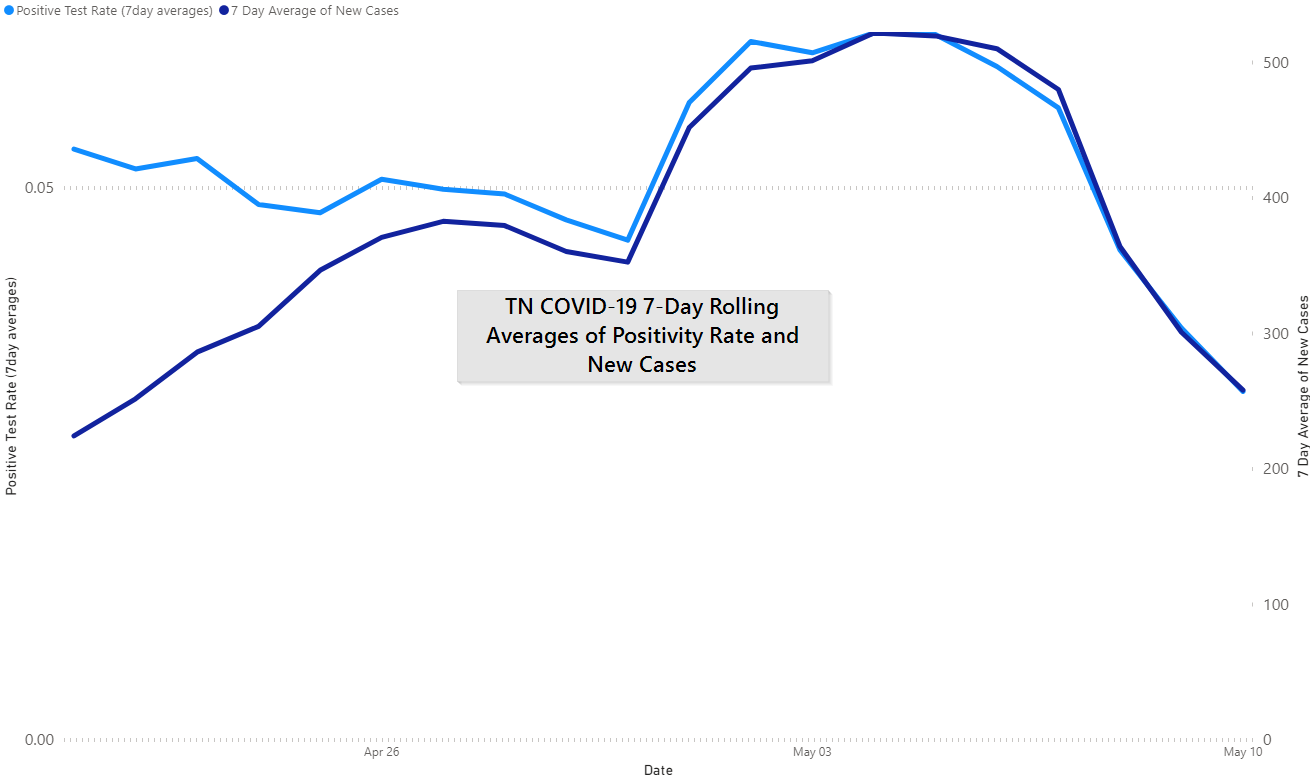
According to Harvard, Tennessee is one of 7 states doing enough testing. They use the same positive test ratio that we’ve referenced here, a 10% positivity rate. Also, they use 7-day rolling averages for tests and new cases as we have.
Note: Tennessee could easily go over 10% this month because of the targeted testing that the state is conducting. This is where context becomes incredibly important: if 15,000 Tennessee inmates test positive in a matter of 2-3 weeks but most of them are asymptomatic, is 10% still the right target number? Or do you keep the 10% target for community transmission but not prison transmission? We expect to see state leaders approaching these as separate topics from a health perspective.
Restaurants open tomorrow in Nashville.
Tennessee is testing all of their prisons after one prison tested positive at a 50% rate; 98% were asymptomatic.
The Friday KCHD briefing confirmed that elective surgeries (non-emergency surgeries) will resume in a phased-in manner, starting with outpatient surgeries. Dr. Buchanan also said that Knox County is working through several cluster events (at least 2 COVID-19 cases together) but attributed all of them to families.
An asymptomatic employee at Wampler’s Farm Sausage in Lenoir City, TN tested positive for COVID-19, Friday. We’ll see what happens here, clearly, meat processing plants have been a major source of outbreaks in other areas of the country.
Numbers
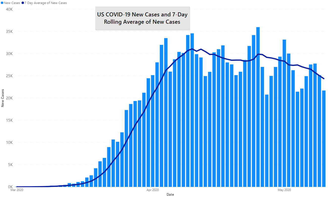
Nationally cases appear to be declining — and they are — but, as we’ve reported for weeks here, the story in New York is different than the story elsewhere.
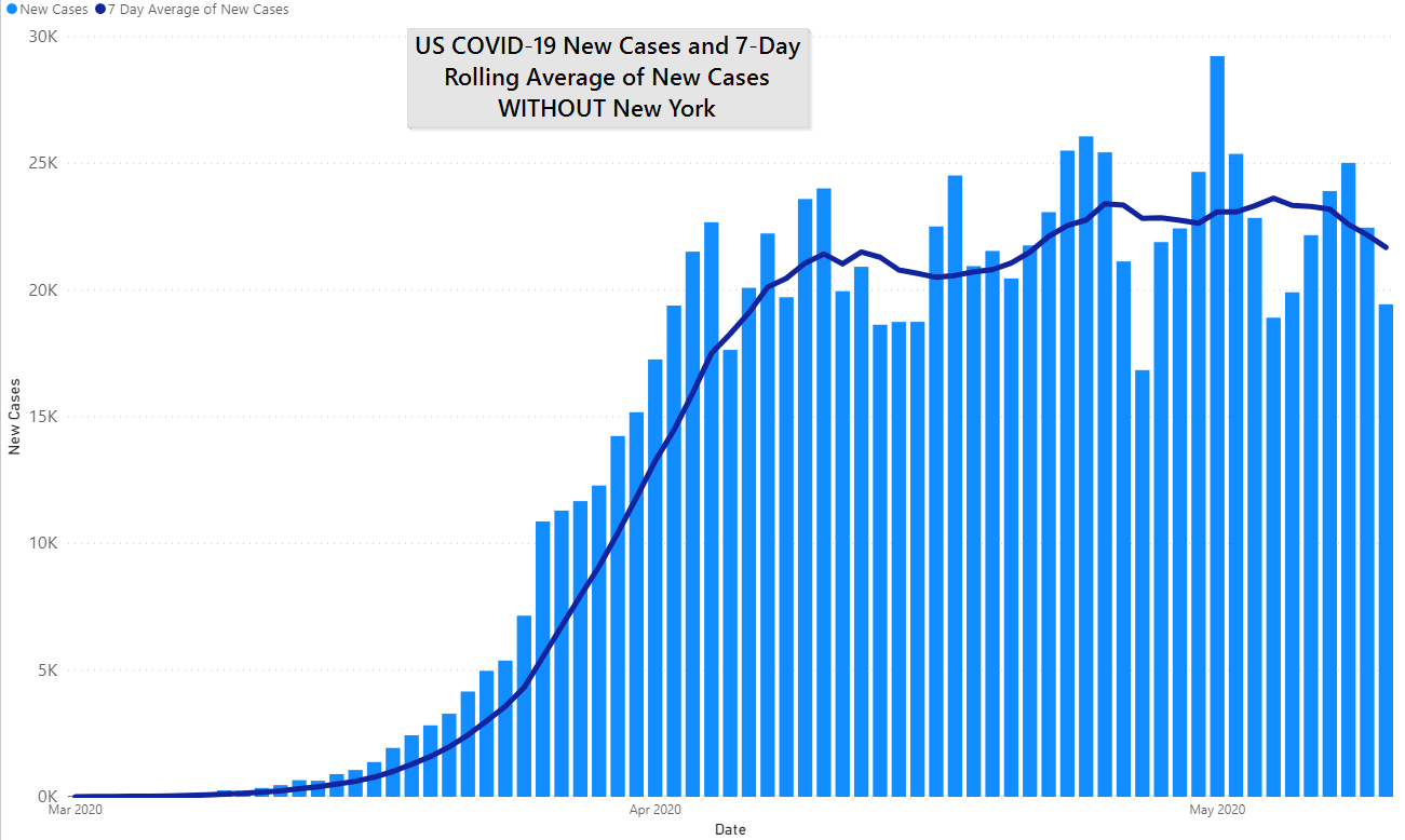
If you remove New York completely, we are maybe beginning a decline. There certainly is not enough of a streak to say that definitively. Sounds like what we said last week.
Deaths look pretty much the same: the curve is very, very flat, and about tied for the leading cause of death in the United States. (If you included probable deaths it would be the current leading cause of death far and away.)

Like cases, taking out New York takes out any notable decline:
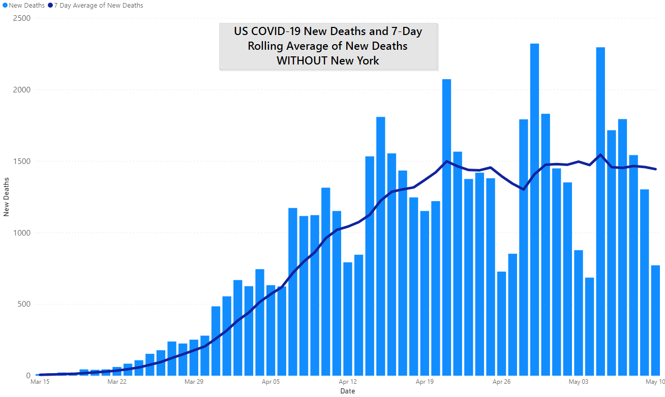
There are many different correct ways to look at this chart of deaths. Here are what we think are the most important:
- Going back to our beginning analysis, it’s a long road ahead
- The overall situation isn’t better than it was a month a ago, it just isn’t worse either
- Until a vaccine comes this is what the path to herd immunity looks like: a new killer of Americans
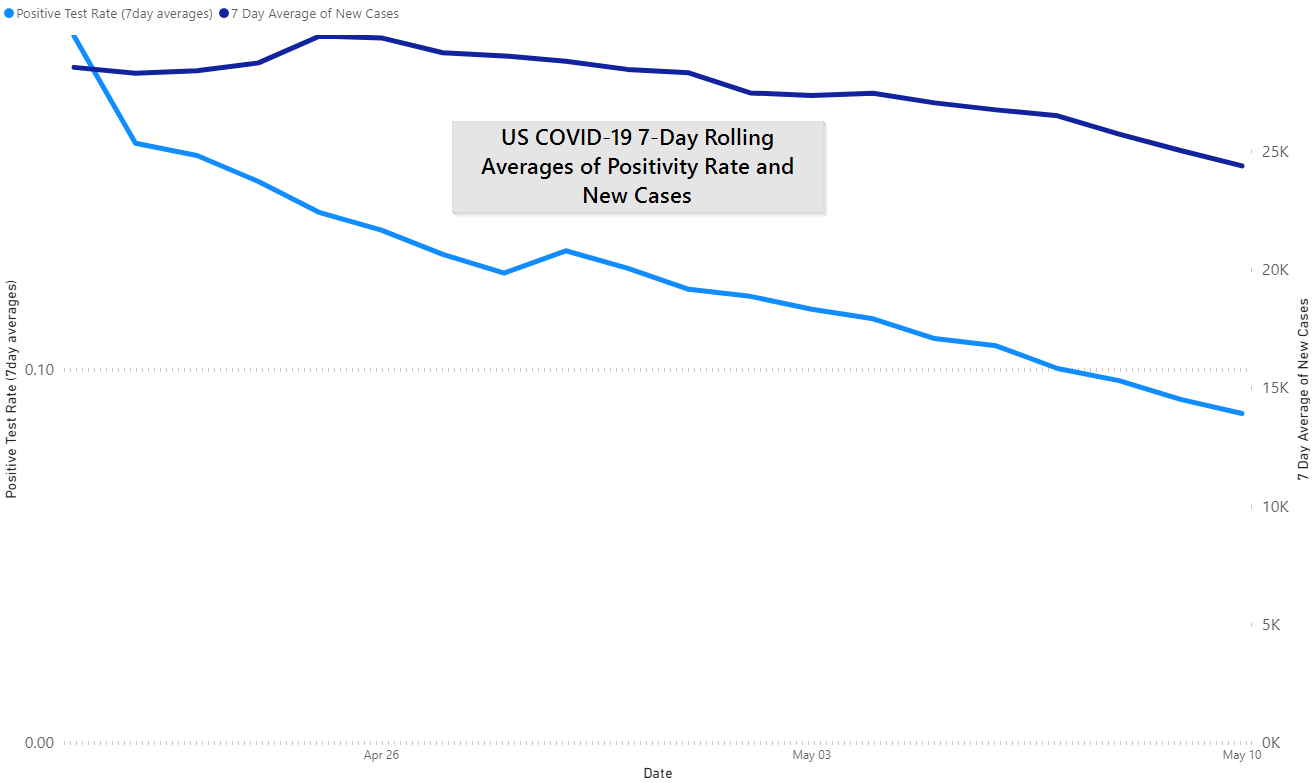
For the first time in our reporting the positivity rate in the US has fallen under the 10% threshold.
Moving on to Tennessee, which remains an outlier (aka unlit powder keg):
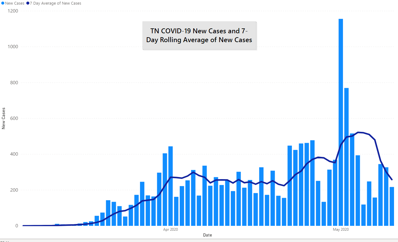
And as we reported above, testing is a real bright spot for how Tennessee has handled COVID-19 so far. We believe that jump is a set of results from a prison coming back, otherwise we might be lower. However, Tennessee is handily beating the 10% target currently.
Sub-regionally our case count is steady, a very low burn. Yes, it appears to take an impossible step back. Typically this happens when a case is incorrectly registered inthe wrong county and then subsequently “transferred” to the correct county.
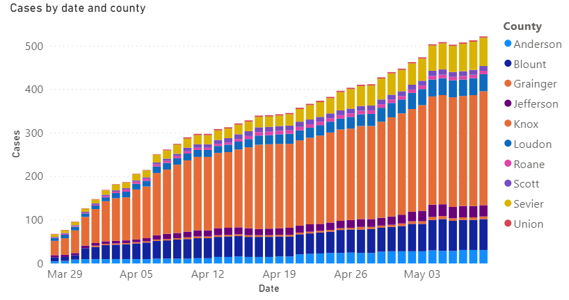
Knox County numbers:
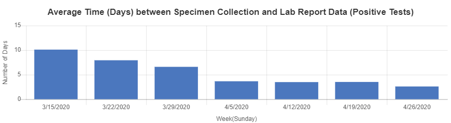
Knox County Health Department is also releasing much more data on their website, this one shows the lag between when a test is taken and when the result is returned. It is down to 2.6 days, the right direction but still a day and half too long:
Finally, we have cases by ZIP code in Knox County, a map we show because you want to see it. Take it with an entire salt shaker, results may be as much about population density and testing access as bona fide cases or disease burden.
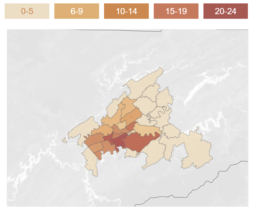
Of course, even with those caveats, it’s hard to imagine that opening up won’t bring more cases, and deaths.
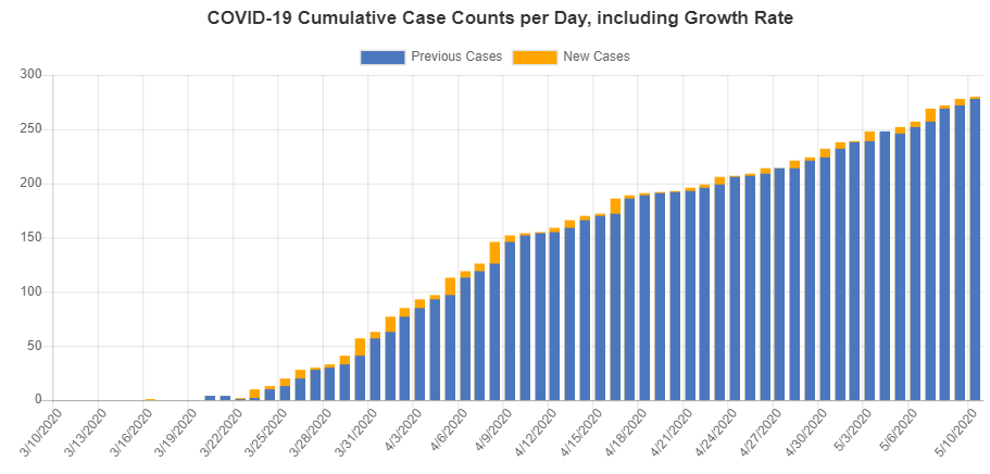
Knox County remains in its own little world. One of the most important aspects of our low growth in the absolute number of new cases today is that our health department has enough to staff to do testing and contact tracing. After you get above a certain point your percentage growth rate can be slow, or even negative, but you still don’t have enough people to fight it. The cat is still in the bag here.
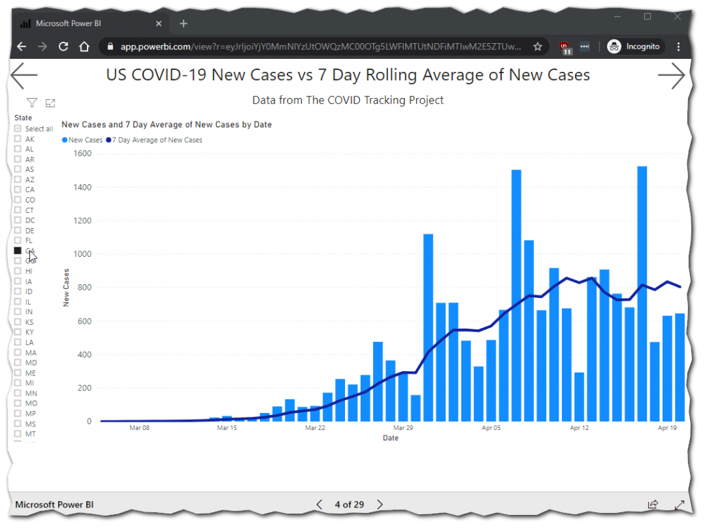
By the way, if you want to see the same graphs for your state click here, we pull nearly all of our own visuals from this report. Typically updated at the same time the evening’s post goes up.
Here are GA new cases.
Also, you can do it on your phone but it is much easier to navigate on a bigger screen.
These posts helpful?
Then go ahead and share them where you saw them once or twice a week.
Get In Touch
Need help thinking this through? Access to more data? Help getting your technology in order to handle what’s here and what’s coming? Contact us today.
[wpforms id=”4995″]Other
Thanks to those that have shared kind words or liked these posts. We’re doing out best to put out data-driven analysis, each one of these takes about 2 hours. It’s helpful to know that they are being read.
If you want copies of the Excel sheet and PowerBI Reports we use to put these together email us, info@jmaddington.com. Right now, our PowerBI combines data from NYT, COVID Tracking Project, IMHE and the TN Department of Health. Most sets are updated daily

Download our Report!
Get your copy of What Every Business Owner Must Know About Hiring an Honest, Competent, Responsive, and Fairly-Priced Computer Consultant.