Today we’ll look at three Southern states that opened around the same time and compare how they are doing.
Re-Opening
Tennessee is now 17 days into re-opening, as is Texas. Georgia got the jump on us and began their re-opening on April 24th, a week earlier. Of those three states, Texas probably had the most conservative plan, Tennessee right behind it, while Georgia’s plan was… ambitious.
So, this far in what does the data say?
We’re going to start with one giant caveat, in many ways a post like this ought to way until a full three or four week have passed to make judgements. However, our belief is that in each of these three states the data is consistent enough in its trends to start making calls, even if its early.
[Edit: 5/18/20] A thoughtful reader (thanks Rob!) points out the charts below could be misread. To be clear, even though we have highlighted the entire opening period, only the most few recent days would have cases that began during the re-opening period.
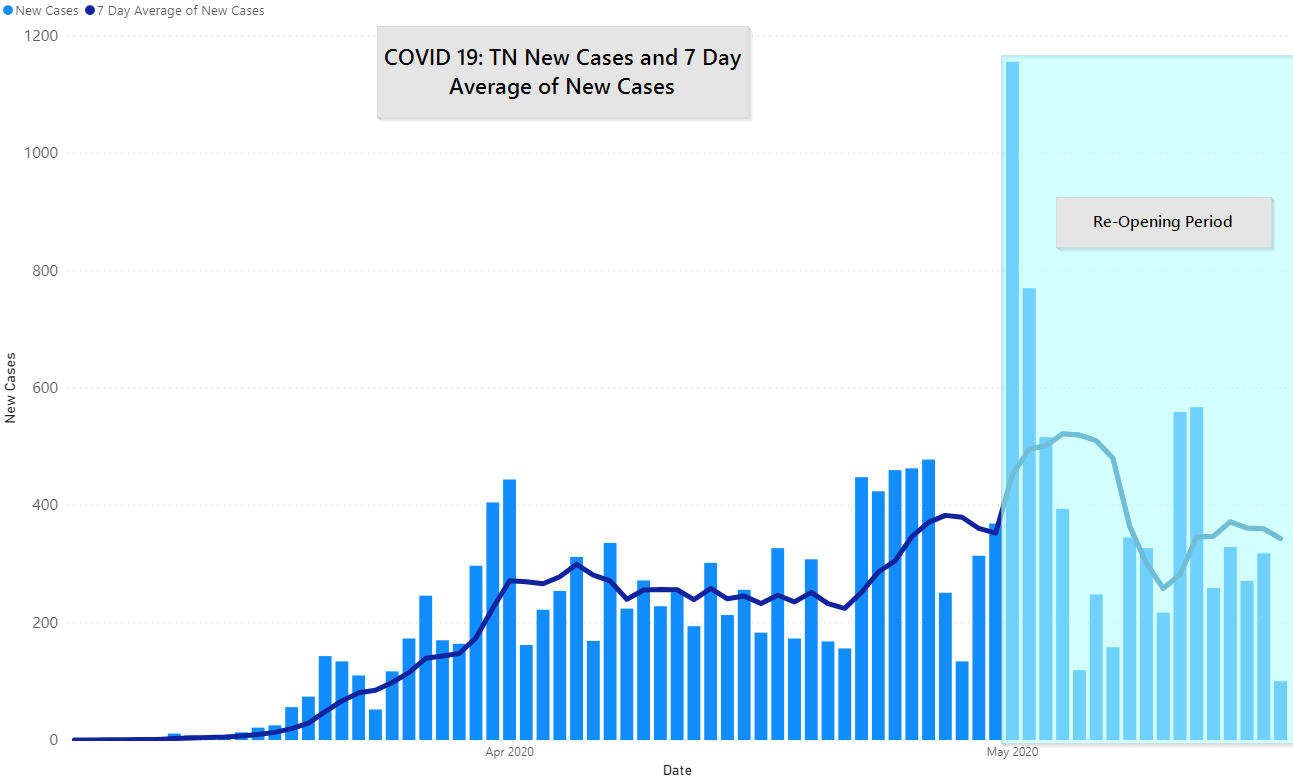
Tennessee Re-Opens
Tennessee began a trend up at the beginning of the re-opening period, on that cannot be attributed to re-opening and is most likely from targeted testing that began at correctional facilities. Last week’s bump is attributable to the same thing.
Overall, it’s remarkably unremarkable. We are, essentially holding stead since mid-April in community cases. Our testing remains high enough that we are testing roughly twice the target. And even as we target populations where we expect to see more cases (prisons, nursing homes) the testing ratio remains great.
The cases that we do have remain around Nashville and Memphis. This map, which you won’t find elsewhere, shows cases for just the last 2 weeks by county in Tennessee. The one part that isn’t clear is that Davidson and Shelbyville are much higher than the surrounding counties, even though they come out in similar colors.
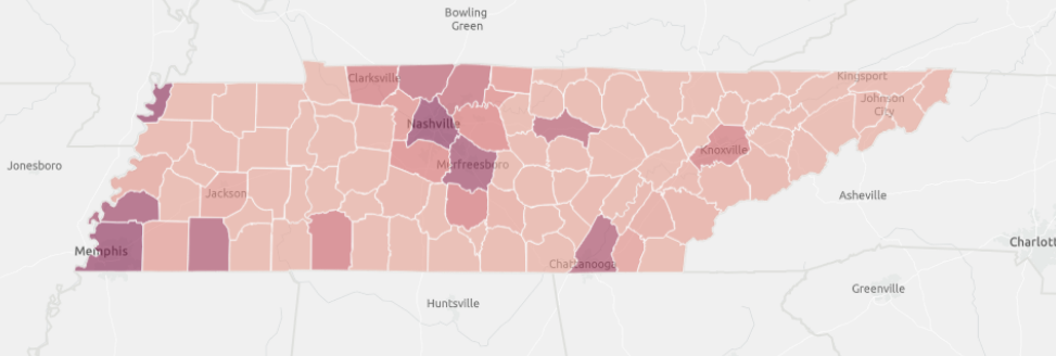
This map matters because if you look at total cases, ever, then much more of the state looks awful.
For the local situation we are going to introduce another new chart, new cases by county by day. And in short, the Knox County region is just steady. We peaked in mid-April but just never had an awful spike. In fact, in the last 7 days Knox County has only seen a new of 28 new cases.
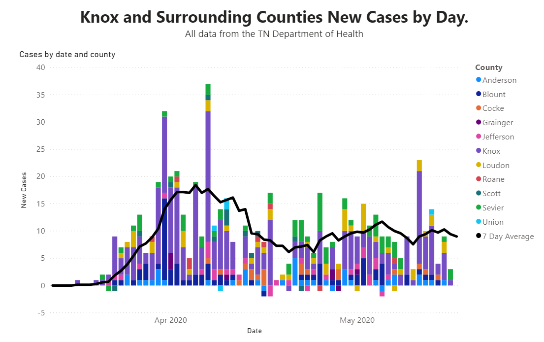
To prognosticate: we don’t believe that anywhere in the US can or will see a caseload lower than Knox County’s for any sustained period while COVID-19 is still circulating widely. We really think that this is as good as it gets.
So, Tennessee seems to be doing really well on re-opening.
Georgia Re-Opens
Until Wisconsin threw out their entire stay-at-home order and filled up the bars in a single night Georgia really held the title of most ambitious re-opening plan. Candidly, even “plan” seems like too kind of a word to use. So, how has Georgia done, with a one week head start?
Quite well. Like Tennessee, Georgia shows stability more than anything. not a sharp decrease but no explosive outbreak here either. Their testing continues to ramp up and Georgia also does about twice as many tests as is targeted. Note that their new cases per day is roughly double Tennessee’s.

Their primary outbreak is constrained to a single geography: around Atlanta, with 36% of all cases:
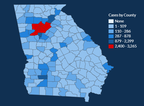
Those five counties are also showing a decrease in cases over the last two weeks. Incredibly, that decrease becomes much more pronounced the longer Georgia has been opened up.

Georgia has been critiqued for having data lags that last up to a couple of weeks, so it is possible that we’ll see the data for early May change. However, the data we have now shows that Georgia also is opening up alright.
Texas Reopens
So, the South is two for two so far, what about Texas? Their stay at home order expired the same date as Tennessee’s and their business capacity was held to 25%, half of Tennessee’s. Although Texas also allowed for some more industries to re-open.
Texas is where the successful re-opening story goes to die. They went from a downward trend in Late April to an uptick in new cases that began at least a week before opening up even took place, and that hasn’t abated since. Their new cases per day (average) are roughly triple Tennessee’s (with about 4x the population). And this is even though Texas is also testing about double the testing target.
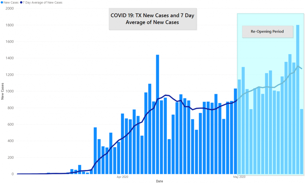
Not shown are deaths, which are ticking up in Texas since last April as well. If there is a mitigating factor is it that Texas has nearly 30 million people. Also, to keep things in perspective their peak is still over 30% lower than New York’s lowest point post-peak, and New York state has less than two thirds as many people.
It’s possible that there are specific factors driving the outbreak that we’re unaware of — we haven’t been tracking Texas at JM Addington — but regardless it’s clear that they are having a tougher time of it than Tennessee & Georgia.
What does this mean more broadly?
- There is not a single narrative that explains how the US is handling COVID-19. We’re declining at a nation, with some states holding steady of quickly declining while others move the opposite direction. New York’s best day is still worse than most state’s worst day.
- Opening up has more than one potential outcome: A lot of us are looking at Wisconsin now after their supreme court struck down the statewide stay-at-home order and Wisconsinites quickly filled the bars. However, from our brief analysis here it’s clear that doesn’t determine which was Wisconsin will swing.
- There is more we don’t know than what we do know: it’s hard to lay claim to victory where things are going well when it’s not clear what causes them to go so well in one place and move in the opposite direction in another.
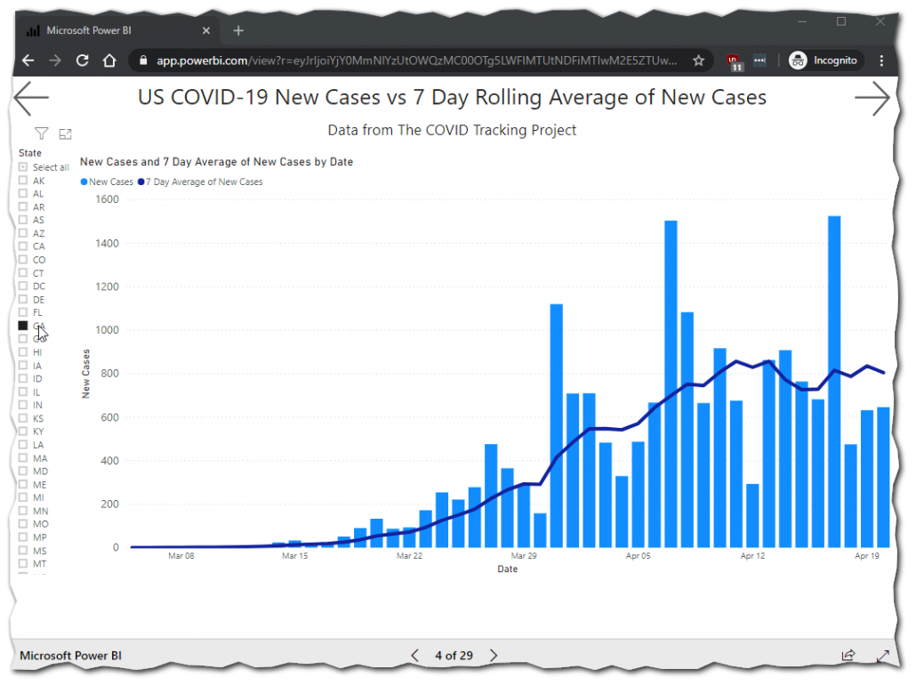
By the way, if you want to see the same graphs for your state click here, we pull nearly all of our own visuals from this report. Typically updated at the same time the evening’s post goes up.
Here are GA new cases from about a month ago.
Also, you can do it on your phone but it is much easier to navigate on a bigger screen.
These posts helpful?
Then go ahead and share them where you saw them once or twice a week.
Get In Touch
Need help thinking this through? Access to more data? Help getting your technology in order to handle what’s here and what’s coming? Contact us today.
[wpforms id=”4995″]Other
Thanks to those that have shared kind words or liked these posts. We’re doing out best to put out data-driven analysis, each one of these takes about 2 hours. It’s helpful to know that they are being read.
If you want copies of the Excel sheet and PowerBI Reports we use to put these together email us, info@jmaddington.com. Right now, our PowerBI combines data from NYT, COVID Tracking Project, IMHE and the TN Department of Health. Most sets are updated daily

Download our Report!
Get your copy of What Every Business Owner Must Know About Hiring an Honest, Competent, Responsive, and Fairly-Priced Computer Consultant.