Today’s post: June isn’t looking lovely right now.
Where to Begin?
It’s hard to know where to even begin today. This week the US saw it’s 100,000th COVID-19 death and yet a single death, George Floyd’s, (rightfully) consumes the nation. The two numbers, 100,000 and 1 are deeply related by the racial inequalities that exist in our nation.
Blacks in America die at a higher rate from COVID-19 than whites and already had a lower expected lifespan. Those who make under $40,000/year much more likely to have lost their jobs; Black Americans earn significantly less than their white counterparts.
Data on co-morbidities, access to healthcare, access to testing are all clear that COVID-19 has a higher impact on black communities than white ones.
In other words, the inequalities that amplify the effects of COVID-19 are the same ones that COVID-19 in turn amplifies (life span, jobs, access to healthcare).
It is impossible to imagine that a virus that amplifies the inequalities that amplify it will not make both the virus and these inequalities worse at the same time. And not just long term: this summer. Higher cases, higher deaths, higher job losses, higher co-morbidities due to lack of healthcare access due to job loss. It’s a nasty spiral.
It is unclear what impact the nationwide protests will have on the COVID outbreaks. COVID-19 research is increasingly looking at indoor settings with poor ventilation as primary locations for virus spread. At the same time, we haven’t had Americans coming together, in such close contact, for so long, day after day since mid-March. Of course, in Minneapolis, the epicenter of the riots and the protests, so many stores and businesses are closed that a different type of social distancing is now in pragmatic effect.
Numbers Going into June
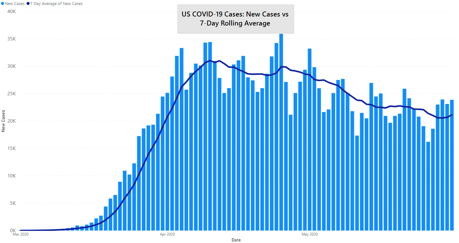
For the first time in 40 days we are seeing an increase in the 7-day average of new cases per day. It is not significant on its own, but we are seeing the 7-day average of new deaths per day also begin to level off. California, Texas and Virginia seem to be driving this upward tick.
We want to be clear that this is not a major reversal from a statistical perspective. However, when the trends for new cases and new deaths aren’t headed in the correct direction and there is widespread civil unrest that is likely to make things worse we aren’t optimistic for the next few weeks.

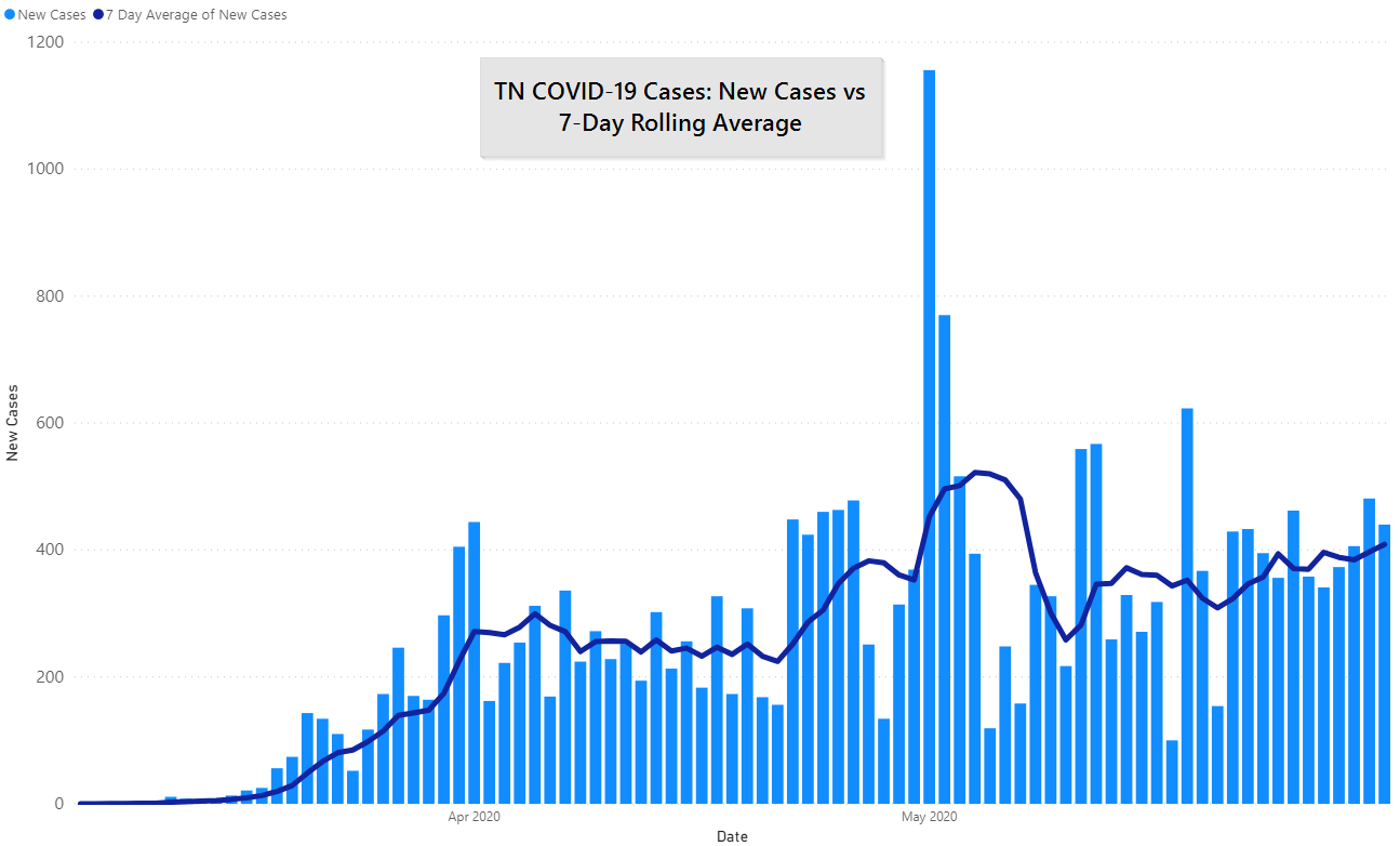
Tennessee is also at a 10-day increase in new cases per day, although that number still remains low in absolute terms. It is also unclear to us what affect targeted testing has had in Tennessee that could skew this upward.
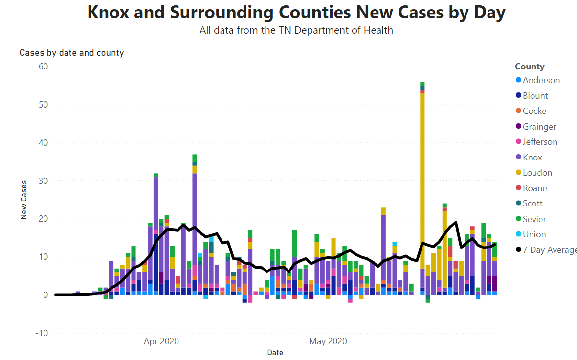
The 10-county area continues to stay between 10 and 20 new cases per day. That’s mostly great.
Less great is Knox County. After dipping significantly right before Memorial Day there has been a steady rise since then. Like Tennessee, our absolute number of cases remains low, however, the convergence of less social distancing and longer test times (see below) become a trio of data points that suggest a likely rise in cases.
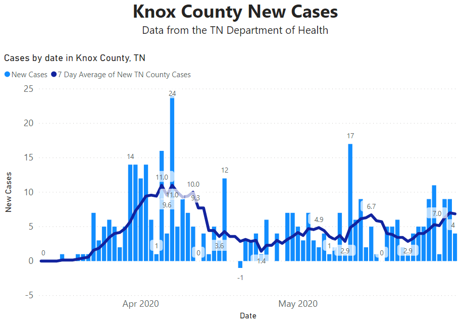
In addition, test result turn-around times have increased from two and a half days (4/26/2020) to nearly four days (5/17/2020). Fast tests are absolutely critical to contact tracing which in turn is critical to keeping a “slow burn” rate from turning into a hockey-stick like graph.
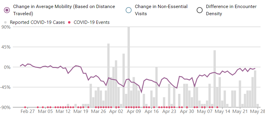
We don’t have great data on what is driving this in Knoxville, but we’ll move into prognostication. We’ve been mildly dismissive of “opening up,” because social distancing data plateaued well before the “lockdown,” ending. Unacast’s data shows Knox County, in particular, picking up movement by May 5th and continuing through May 26th, the last date data is available for. Those three weeks represent 1.5 “full” incubation periods or about 4 median incubation periods. In other words, the cases appear to pick up after Knoxvillians interact more, which is exactly what is expected.
Other News
Three separate unpublished studies are showing that somewhere between 1% and 20% of infected people are responsible for 80% of the overall spread. In other words, many people may barely spread COVID-19 when sick at all, a handful spread it widely. This is not new to Sars-Cov-2. Explainer video.
The CDC is warning that serological tests (antibody tests) are not accurate for any given person. This is important for Knoxville where we’ve seen advertisements for individual antibody tests. These tests are accurate a population level, not for a specific person. For instance, if you wanted to know the overall percentage of Knoxvillians infected so far a random sample of +/- 1,000 people will give you an overall percentage. But for any one person:
…less than half of those testing positive will truly have antibodies.
CDC
Get In Touch
Need help thinking this through? Access to more data? Help getting your technology in order to handle what’s here and what’s coming? Contact us today.
[wpforms id=”4995″]Other
Thanks to those that have shared kind words or liked these posts. We’re doing out best to put out data-driven analysis, each one of these takes about 2 hours. It’s helpful to know that they are being read.
If you want copies of the Excel sheet and PowerBI Reports we use to put these together email us, info@jmaddington.com. Right now, our PowerBI combines data from NYT, COVID Tracking Project, and the TN Department of Health. Most sets are updated daily

Download our Report!
Get your copy of What Every Business Owner Must Know About Hiring an Honest, Competent, Responsive, and Fairly-Priced Computer Consultant.