There is a lot of news out there, today we’ll focus on numbers and we’ll return for news later this week.
Back in April we began reporting on how there wasn’t a single COVID-19 narrative to find, there were several. In the middle of June we solidly there. The COVID-19 stories are regional at best, and often state by state. Let’s start by looking at this estimated R_t map from covid19-projections.com, which we will take a proxy for COVID-19’s current growth rate:

Tennessee is flat, Alaska is in great shape, California and Arkansas don’t look great. We won’t take a deep dive into all of these states, we have a deep belief that more context is required in each instance to really understand what is happening. And we don’t have time to digest how each state is handling COVID-19.
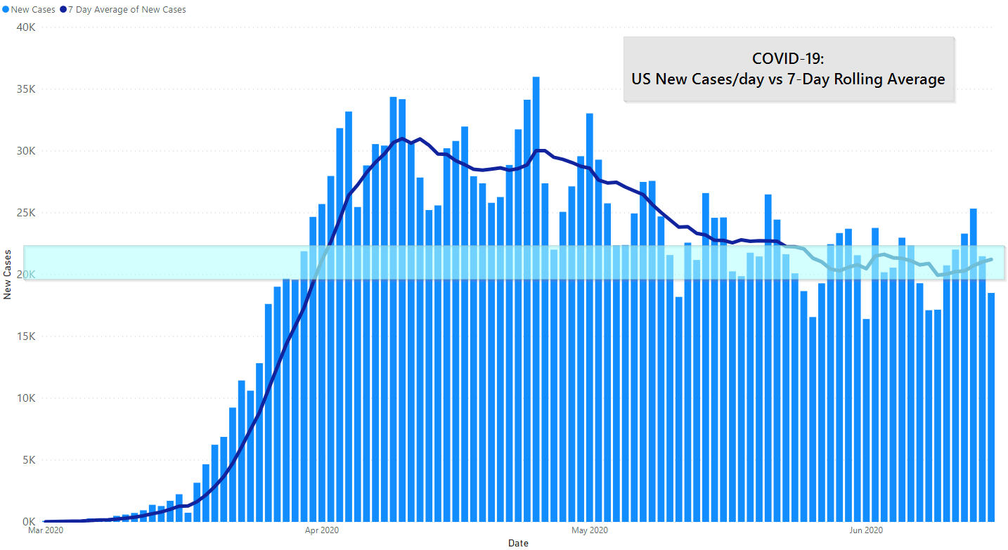
Across the board, you can see that the US continues to stay in a narrow band, with the 7-day average of new cases staying between about 20,000 and 22,500 per day. A reminder, we rely on the 7-day average because daily reporting seems to be affected by non-diagnostic criteria. I.e., there are dips on Mondays that are most likely the result of weekend-induced reporting delays, not that COVID-19 is a Monday slacker.
In addition, we can see that growth rate of new deaths per day compared to new cases per day is dropping:

It’s hard — maybe impossible — to know the cause. Maybe people most vulnerable to COVID-19 are staying home more; maybe we are testing better; maybe test variances in some states are artificially inflating positive numbers.
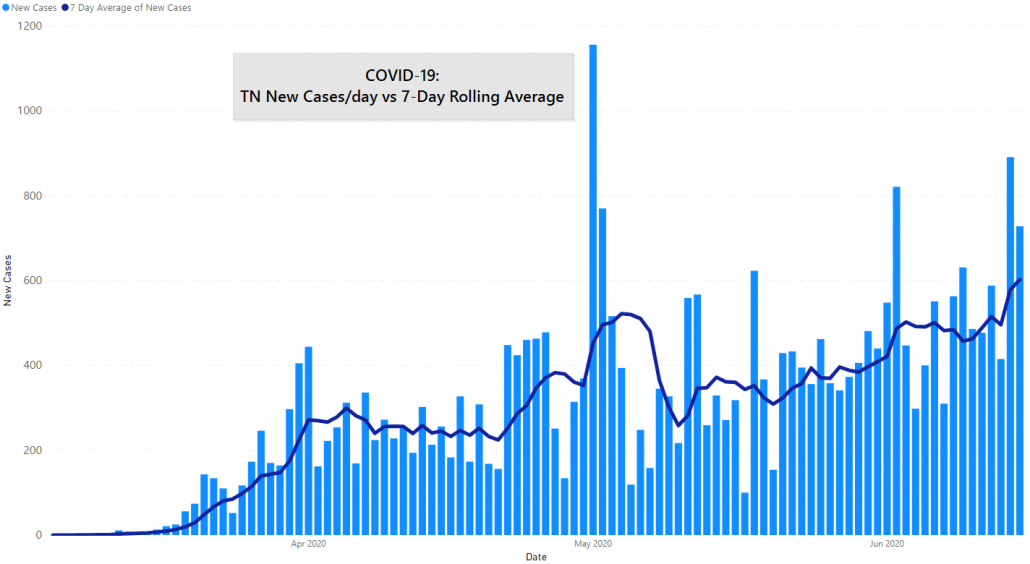
Tennessee continues to see greater new cases per day.
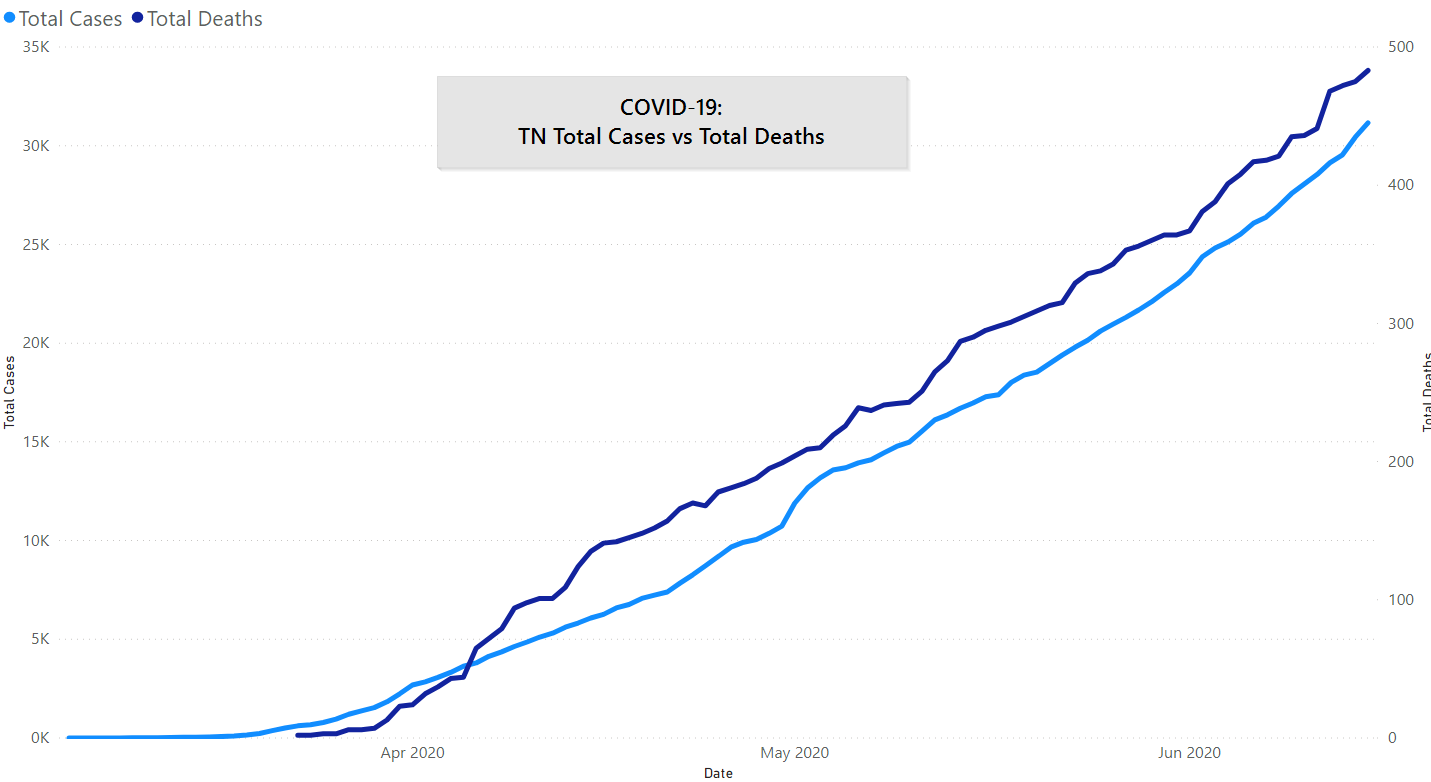
Unfortunately, here we see deaths tracking very closely with cases. For a rough comparison, if we extrapolate from current deaths over 90 days (483) and annualize it we get about 1,900 deaths over a year. In contrast, Tennessee had about 1,100 traffic fatalities in 2019. (Don’t take the analogy too far: crashes are not contagious.)
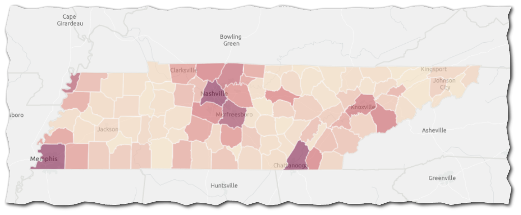
Tennessee won’t give us a single narrative either. This map by JM Addington shows the 2-week total of new COVID-19 cases by county in Tennessee. Shelby (1729) and Davidson (1613) counties are clearly continuing to be hit hard with the broader Nashville metro area also showing higher than most counties. Hamilton County (859) is also high. Knox & Sevier Counties are both at 161.
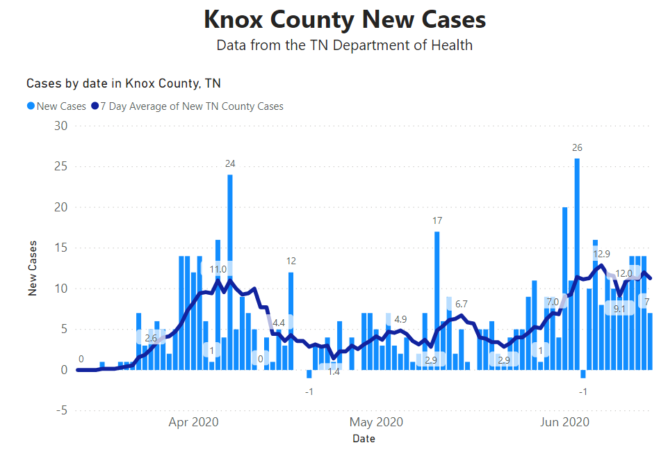
Regionally, Knox and Sevier counties are driving up the daily average significantly.

Knox County remains about as high as we’ve ever been, but as high as we ever were wasn’t that bad (13 new cases/day average).
What does it all Mean?
So, for context, cases are dropping nationally, deaths are dropping faster even as economies re-open and protesters hit the streets in major cities across the US. Maybe COVID-19 is just going to go away?
We’re super skeptical of that. The most optimistic theory would be that we’ve figured out how to live with this virus without it destroying us. The most pessimistic theory would be that all of our efforts only had a minor impact and, like 1918, a second, larger wave awaits us.
We believe that no one can say for sure what the coming months look like. Internally at the company, and your humble author, continue to do our best to prepare as if the fall is going to be as bad or worse both from a medical and an economic perspective. (1) There are only upsides to us being wrong about that, (2) September is too late to prepare for an October wave.
Get In Touch
Need help thinking this through? Access to more data? Help getting your technology in order to handle what’s here and what’s coming? Contact us today.
[wpforms id=”4995″]Other
Thanks to those that have shared kind words or liked these posts. We’re doing out best to put out data-driven analysis, each one of these takes about 2 hours. It’s helpful to know that they are being read.
If you want copies of the Excel sheet and PowerBI Reports we use to put these together email us, info@jmaddington.com. Right now, our PowerBI combines data from NYT, COVID Tracking Project, and the TN Department of Health. Most sets are updated daily

Download our Report!
Get your copy of What Every Business Owner Must Know About Hiring an Honest, Competent, Responsive, and Fairly-Priced Computer Consultant.