Today is numbers.
The short version of today’s post? Infections are up.
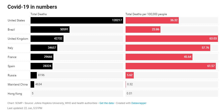
Worldwide infections topped 9 million today. CIDRAP reports, “It only took 6 days for the pandemic total to rise from 8 million to 9 million cases, 2 days less than it took for the number to rise from 7 million to 8 million.” The US far outpaces the rest of the world in total deaths, although per capita we fare better.
For the last couple of weeks we’ve noted that US cases have stated within a relatively narrow band of variation. Today, we are way past that, with a 7-day average of over 27,000 new cases per day.
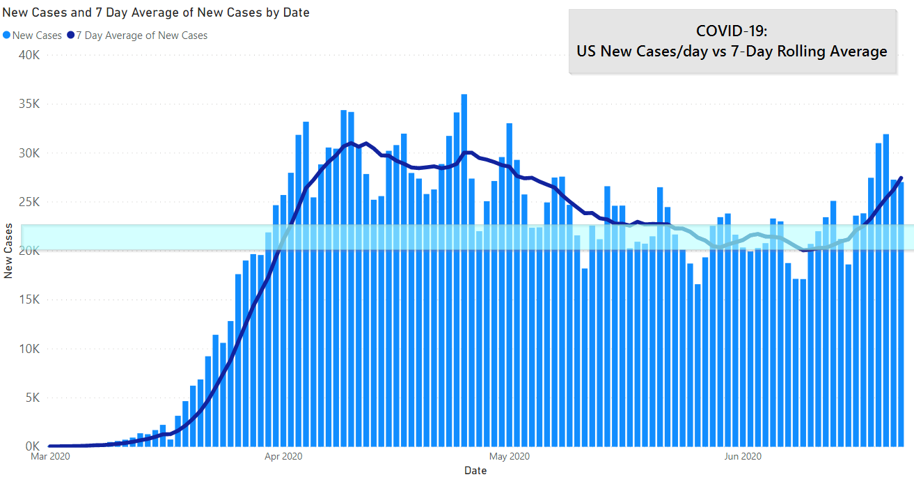
That’s a steep curve upwards friends.
There are some circles advocating that this is due to increased testing. Testing is increasing, but new cases are increasing at a faster rate, show in the positivity rate:
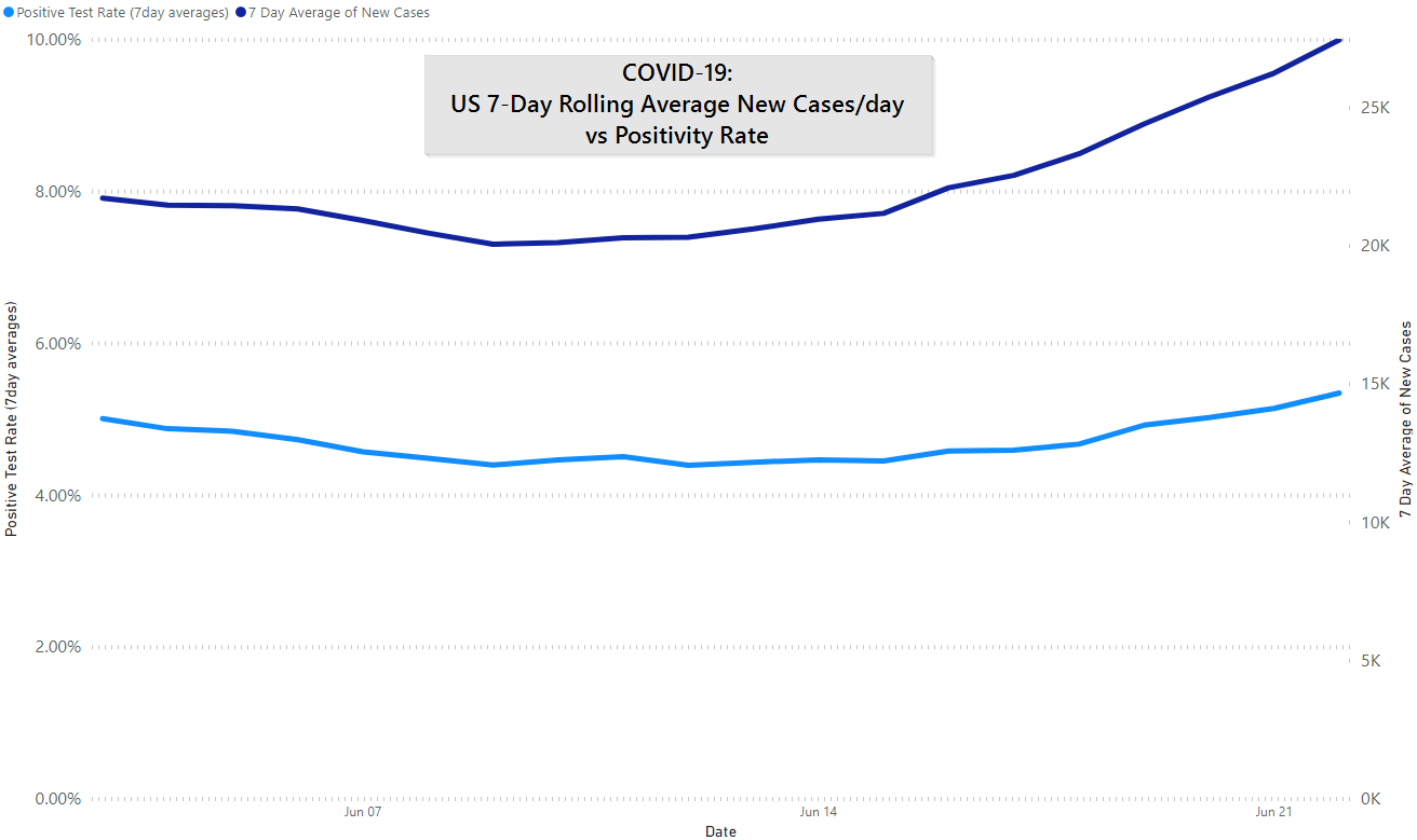
That rate is in an OK place, it used to be north of 20% and now we’re closer to 5%. However, it certainly does not indicate over-testing.
The good news is that deaths per day are headed down. So while we are seeing more cases we are seeing fewer deaths. [1] Deaths lag new cases, it isn’t clear if we’ll see in uptick in deaths in a week or two after this increase.
Below is a complex graph: it shows the new cases per day by state. So, early on you can see New York in the green making up the biggest chunk of cases. Now you can see TX (blue, top), FL (teal, near the bottom), AZ (reddish, near the bottom), and CA (pink, neat bottom) pushing up cases.
The takeaway should be this: the COVID-19 pandemic is the United States is moving not ceasing.

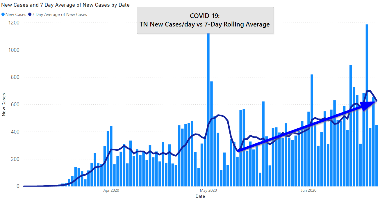
Moving to Tennessee, we also see numbers continuing to rise, you can see a rough trend line we overlaid.
The map below shows the last 14 days of cases by county in Tennessee.
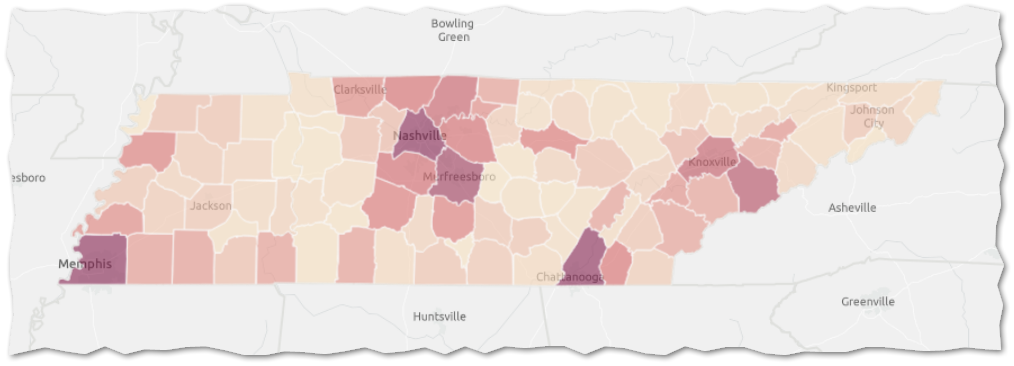
It is critically important to realize how cases are attributed: cases get assigned to the infected person’s county of residence. So, you travel to Memphis and get sick there it will still be attributed to Knoxville. Likewise, if a tourist travels to Sevierville and gets COVID-19 it will not be counted against Sevierville. (There is an out-of-state category that we don’t typically report on.)
If we look at the Knox County area you can see both Sevier and Knox counties driving an increase in cases:
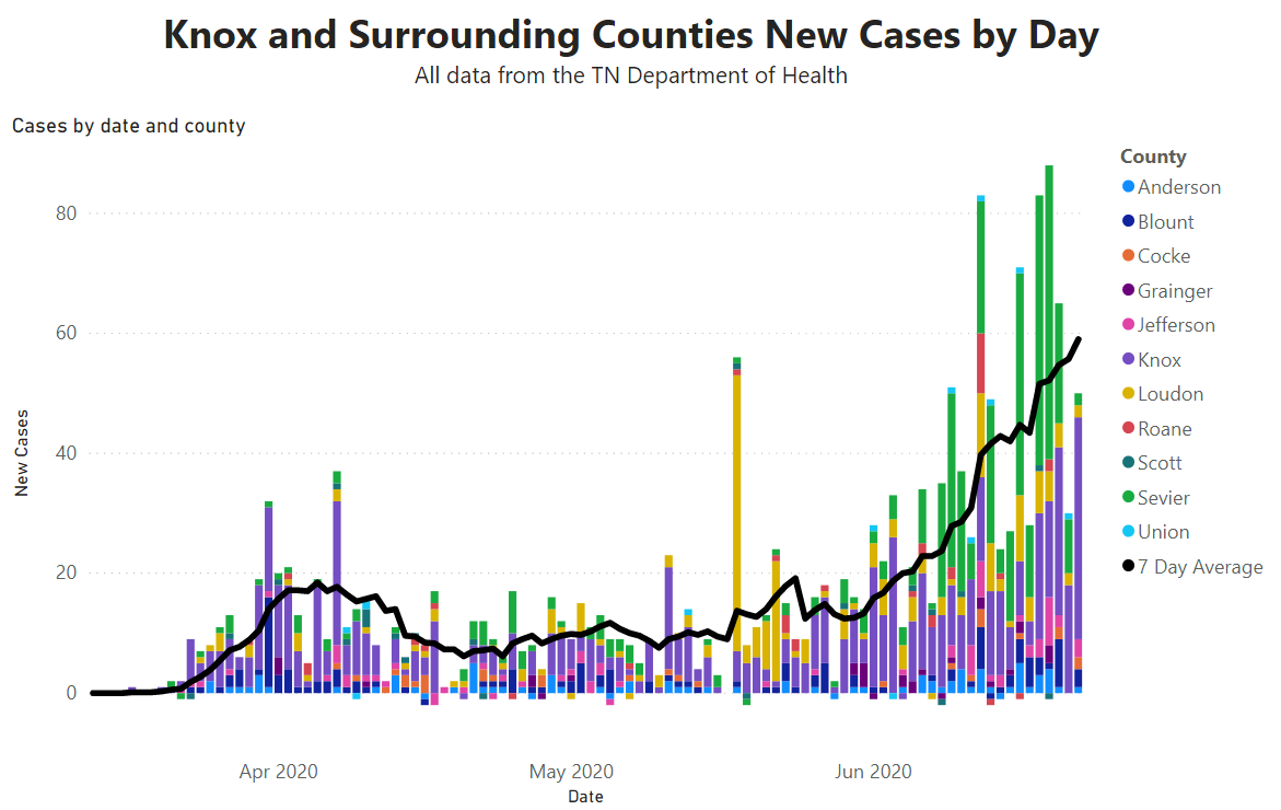
Again, we’re seeing a really steep increase in cases.
State officials haven’t given an explanation for Sevier County’s case increase, however WBIR noted that the Smokies saw over 800,000 visitors during the partially opened month of May.
We don’t have solid data that shows what is behind the increase. Still, we’re willing to speculate that opening up that area to tourism again is a likely explanation. If you’ve been to Sevierville and Gatlinburg you understand that outside of the park proper it is not setup for social distancing.
Moving to Knox County, we’re up to an average of 19 new cases per day. A new high, which has KCHD “concerned.”
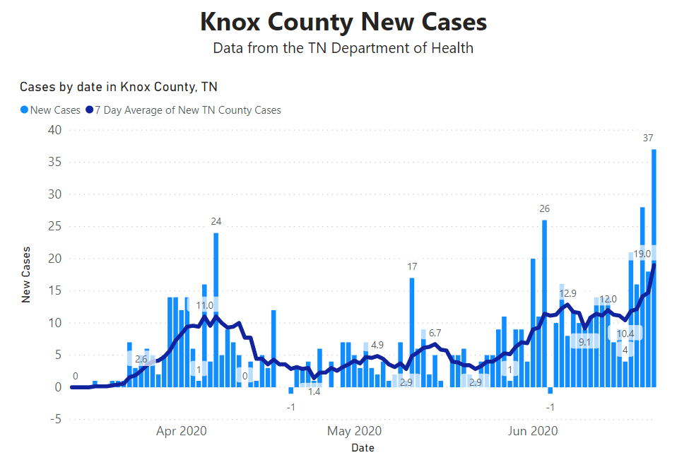
In addition, COVID-19 regional hospitalizations are up and ICU capacity is headed down. The health department said that the share of “younger” people with COVID-19 is increasing. In absolute numbers both the area and Knox County cases are low. However, the trend lines are truly concerning. In particular, if what we are seeing are new cases from infections that occurred 5-10 days ago, there is the possibility that we’ve had that much more spread before we even saw the uptick.
How We Are Adjusting
We are likely to transition to our Work Safe Level 2 this coming week, which is a more conservative stance from Level 1, where we are currently.
Personally, we continue to get most groceries delivered and won’t inside restaurants. These numbers, for your author, rule out anything less conservative. Restaurant patios are probably also out for now, although curbside pickup has been great.
Get In Touch
Need help thinking this through? Access to more data? Help getting your technology in order to handle what’s here and what’s coming? Contact us today.
[1] The COVID Tracking Project stopped giving new deaths by day as a data column; we are presently unable to show this as a graph. [wpforms id=”4995″]Other
Thanks to those that have shared kind words or liked these posts. We’re doing out best to put out data-driven analysis, each one of these takes about 2 hours. It’s helpful to know that they are being read.
If you want copies of the Excel sheet and PowerBI Reports we use to put these together email us, info@jmaddington.com. Right now, our PowerBI combines data from NYT, COVID Tracking Project, and the TN Department of Health. Most sets are updated daily

Download our Report!
Get your copy of What Every Business Owner Must Know About Hiring an Honest, Competent, Responsive, and Fairly-Priced Computer Consultant.